
Redefining intensity and heritage for a British icon
How our team helped Aston Martin bring to life an ultra-luxury digital experience
setting the scene
Aston Martin has long created the most iconic, luxury British cars. As they expanded into Formula 1, alongside a rebrand and strategy towards ultra-luxury, we worked closely to ensure that this new brand vision would come alive in the digital experience for their global rebranding launch on Aug 22'.
The project started on Feb 22', giving the team 4 months to scope, design and develop the project. Our team of 2 UX (a lead and me) designers, 1 UI designer and 1 PM were in charge of the design and EPAM of the development.
My role
Research
Led the execution of the research we defined with the UX lead like ecosystem mapping and competitor benchmarking
define
Defined, together with the UI designer and the client, the visual direction
design
Redesigned and A/B tested the homepage and main nav with the new defined visual direction
the main challenges
-
Loosely defined meaning of 'digital experience'
-
Simple reskin or complete redesign?
-
Accessibility is not a priority
-
High expectations and tight deadlines
high level goals
-
Bring the new brand identity of Intensity into the digital experience.
-
Give the digital experience a sense of ultra-luxury: experiential rather than just informational
-
Increase traffic to key sites across the ecosystem like model configuration and F1

sneak peek
COULDN'T RESIST,
COULD YOU?
THE CASE STUDY
Part 1
Let's redesign a site but... what site?
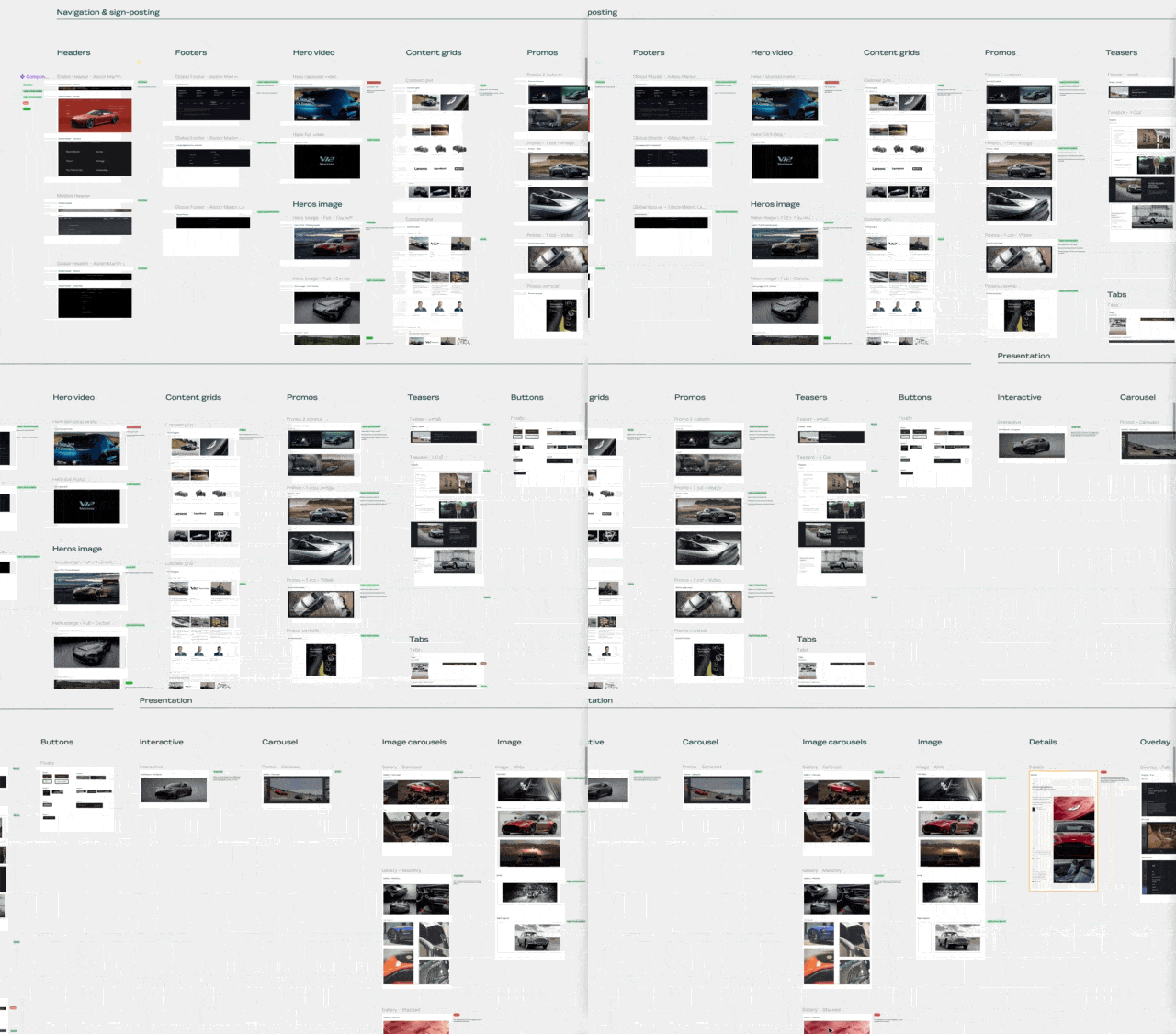
The first step was to understand the current Aston Martin digital ecosystem and what made it tick. We started wide, exploring the number of websites and domains under Aston Martin, and then we moved into the specific core sites: their architecture, the components and styles used across the sites.
With this information we aimed to define the scope and how much work will have to be done.
tl;dr
What
we
learnt
Big ecosystem, poorly connected
We focused on the homepage, navigation, car model and article pages. Changes in these pages would ripple across the rest of the site and AM's ecosystem.
9 templates made up 90% of the site
Compared to other brands in the auto and luxury industry AM's pages performed well but that wasn't enough.
simple reskin or complete component redesign
Got an initial idea of what components would be simply reskinned against the ones that would be fully redesigned.
Part 2
Aston martin's ecosystem is big, got it! So where do we focus?
With an understanding of how wide the A.M. ecosystem was but with an incoming deadline, we had to decide what should be prioritised and how we could make the most out of our efforts.
The focus of the redesign
The goal of the project was for the website to tell the new brand vision of intensity and heritage. Together with the client, we defined the most influential pages determined by both traffic but also story-telling potential and impact across the whole ecosystem. These pages were the homepage, navigation, standard model template and editorial template pages.
Redesign
homepage


Redesign
Redesign
Navigation


model page


Reskin
Content page
.png)

how are we doing?
how are others doing?
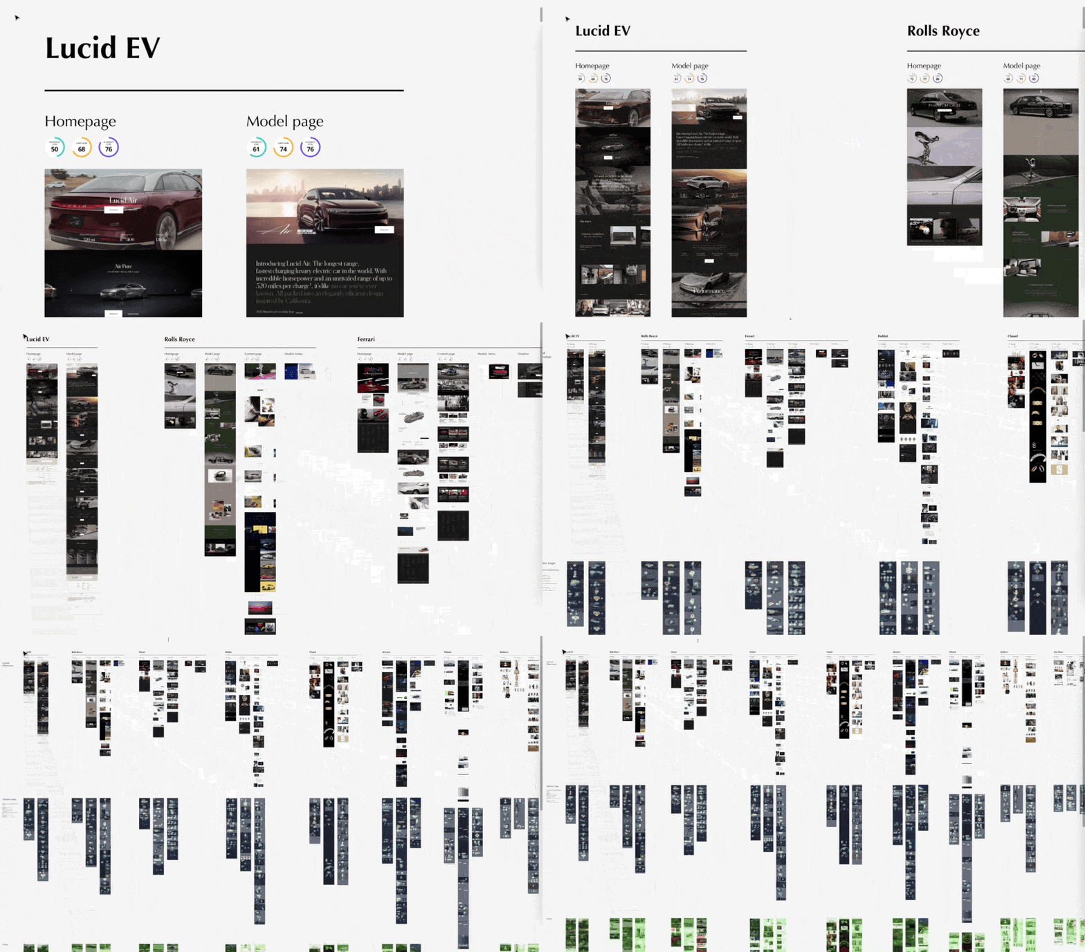
Knowing that we would focus on these 4 pages, the next step was to get an idea of what and how it could be improved. For this, we did a performance check, a visual clarity test and comprehensive benchmarking of other brands withing the luxury market.
Luxury Cars
Rolls Royce
Top-class video content that focuses not only on the car but on all the details that make each Rolls Royce a piece of art.
E-Bikes
Van Moof
Bringing to life the tech that puts the smart in these smart bikes by using interactivity to highlight the bikes' unique features
Electric Cars
Polestar
A minimalist approach that knows when to create intensity through visual content and when to tone it down to be more detailed with words.
tl;dr
What we learnt
Focusing on 4 key pages
As the most influential pages, we focused on the homepage, navigation, car model and article pages. These changes will ripple across the rest of the site and AM's ecosystem.
A.M. does it well, but others do it better
Compared to other brands in the auto and luxury industry AM's pages performed well but competitors like Rolls Royce, Van Moof and Polestar could still be used as inspiration
A story to be told through the senses
This is not a book! Text should weave together a story but it shouldn't drive it. Use a combination of dynamic product content with slower, more focused accents that not only show the car but also create curiosity.
Part 3
Time to start designing
After understanding the breadth of Aston Martin's digital footprint, the scope of the project and the brand's competitors, it was time to start designing but... what exactly should we design?
Homepage: Product or brand?
Before starting to push pixels we had to define the direction the designs should take. With the homepage being the priority we started there. We explored 3 different approaches focusing on a) The brand, its history and heritage, b) The car model range or c) A mix of both.


2 homepage approaches
With the goal of a minimalist approach that highlighted the visual content, 2 different approaches were agreed to be tested with the client.
Product / Brand balanced
A lengthier version that had content about the models but also pieces to build a brand story

Product focused
A more concentrated version that mainly highlighted car models through powerful video content

Main nav: a fractured experience
The navigation had a very 'unique' approach. Splitting the menu into two halves, both having different menu items. This was a problem as it hindered discoverability and when the menus where open there was no clear indication of what would happen next.
Elevating the Navigation
We explored different approaches to navigation and how different levels should shown intuitively. We also looked for how many items should this new navigation have.

navigating* different opinions
*pun intended
I argued that taking a more visual direction to the nav using visual assets could highlight either the models or the site's content. After pushback from the client and their design agency, trying to keep a cleaner and more minimal style we stripped down these visual details.
visual approach

simple approach

content approach

2 Final designs
With the direction of a minimalist approach that highlighted the visual content, 2 different approaches were agreed to be tested with the client.
Full nav menu
Include support links like 'Corporate' and direct dealer search, reinforcing it on the footer.

Simple nav menu
Show only key primary and support links, all other content to be moved to the footer.

tl;dr
What we defined
2 homepages
As the most influential pages, we focused on the homepage, navigation, car model and article pages. These changes will ripple across the rest of the site and AM's ecosystem.
2 navigations
Compared to other brands in the auto and luxury industry AM's pages performed well but that wasn't enough.
Part 4
testing 2 approaches
We used the tool Maze, which allows us to create 'paths' using prototypes and measure where users click to accomplish tasks (if they directly/indirectly succeeded or failed) and the time spent on each task.
Methodology
-
Using just one version of the two prototypes, users were assigned 7 tasks to find content on the homepage and the navigation.
-
Next, they had to go through the other version of the prototype and compare the 2 versions using a wordbank and an open text box to explain themselves in more detail.
hypothesis
-
Give priority to visual content: using a highly visual approach using video to the site will delight and communicate the intensity and luxury of the brand without overwhelming users.
-
Simple navigation menu: a navigation menu focused only on the key links will bring focus to the most important content, enabling users to navigate more effectively.
-
More varied homepage layout: having a homepage with more sections will help better define content and ease its findability.
Prototype 1
Product / Brand balanced homepage + Full nav menu

Prototype 2
Product-focused homepage
+ Simple nav menu

High-level results
Our hypothesis tested
Give priority to visual content: using a highly visual approach using video to the site will delight and communicate the intensity and luxury of the brand without overwhelming users.
Simple navigation menu: a navigation menu focused only on the key links will bring focus to the most important content, enabling users to navigate more effectively.
More varied homepage layout: having a homepage with more sections will help better define content and ease its findability.
proved
needs further validation
proved
Part 5
the impact
increased content discoverability
Of key pages like models, the configuration site and F1 site
adaptive and future-proof homepage
The new layout served to create awareness of the rebranding but to later be repurposed for future campaigns
unintrusive & cinematic
design
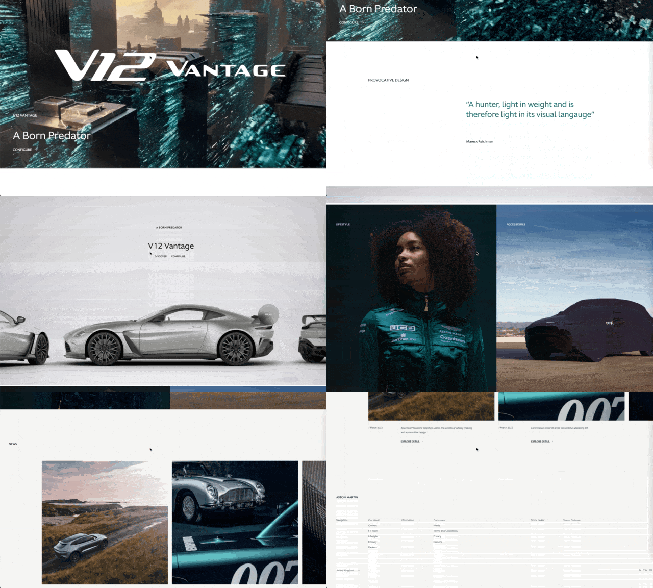
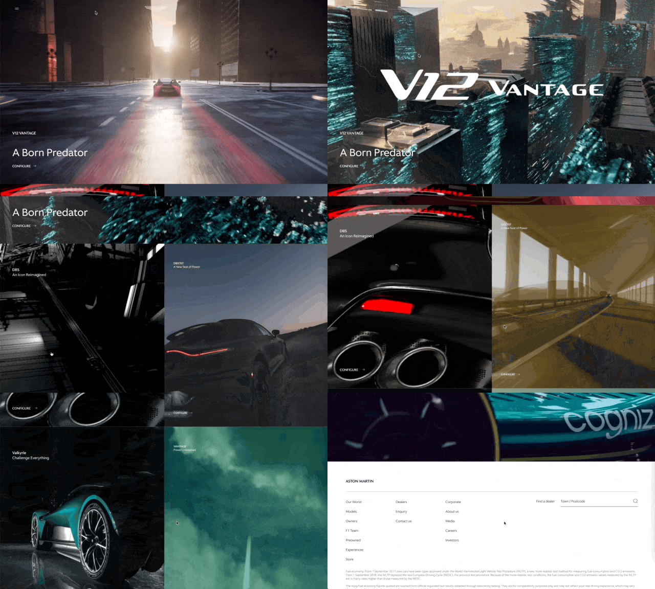
The minimalistic visual direction of the redesign allowed cinematic moments to be at the front and center
1 / 3
homepage
PREVIOUS

NEW

2 / 3
navigation
PREVIOUS

NEW


3 / 3
model page
PREVIOUS

NEW


